The switch is flipped. The signal is live. The new GG Creative website has officially hit the internet.
We built graphicgeeks.gg to feel like us before a visitor reads a single paragraph: loud, direct, a little rough around the edges, and made by people with actual fingerprints. No soft-focus conference rooms. No stock-photo handshakes. No beige wall of agency words explaining how passionate we are about passion.
Just the work, the point of view, and a clear way to get something started.

Plugged in from the first screen
The homepage opens with the line that sets the volume for everything after it:
We’re plugged in with loud ideas and really good design.
That first screen had one job: tell people where we work, what we do, and what kind of ride this is going to be. LBI, Seaside, and The Mainland sit right at the top because our location is part of the story—not fine print buried at the bottom. From there, the headline takes over, the color gets loud, and two exits stay easy to find: start a project or see the work.
It is fast on purpose. A homepage should not make anybody hunt for the point.
Cut through the static

The About section is where the site shows its wiring. Old televisions, torn edges, analog noise, sharp color, and type that refuses to sit quietly all come together in one mixed-media pileup.
That look is not nostalgia pasted on for decoration. It reflects how we work: time-honored methods plugged into modern tools, with every idea pushed around until it feels right. The page carries the marks of that process instead of polishing them away. Tape can show. Paper can tear. Type can shout. The human part stays visible.
The result feels assembled, not generated—and definitely not borrowed from the same template as six other studios.
Four lanes. No filler.

The Services section turns the volume down just enough to make the choices clear. The work is organized into four lanes:
- Branding — logos and identity systems with an actual opinion
- Graphic Design — print, packaging, signage, and collateral
- Web + Media — sites and social content built to hold up on every screen
- Marketing — campaigns that give people a reason to stop and look
Each category gets its own space, its own number, and a short explanation without burying anyone under a truckload of deliverables. The goal was not to make the list look bigger. It was to make the path into a project feel obvious.
Because the four lanes connect, the site treats them as parts of the same system. A brand has to survive on a sign, a package, a phone, a campaign, and whatever gets invented next. Good design does not stop at the logo file.
Built here, without the driftwood typeface
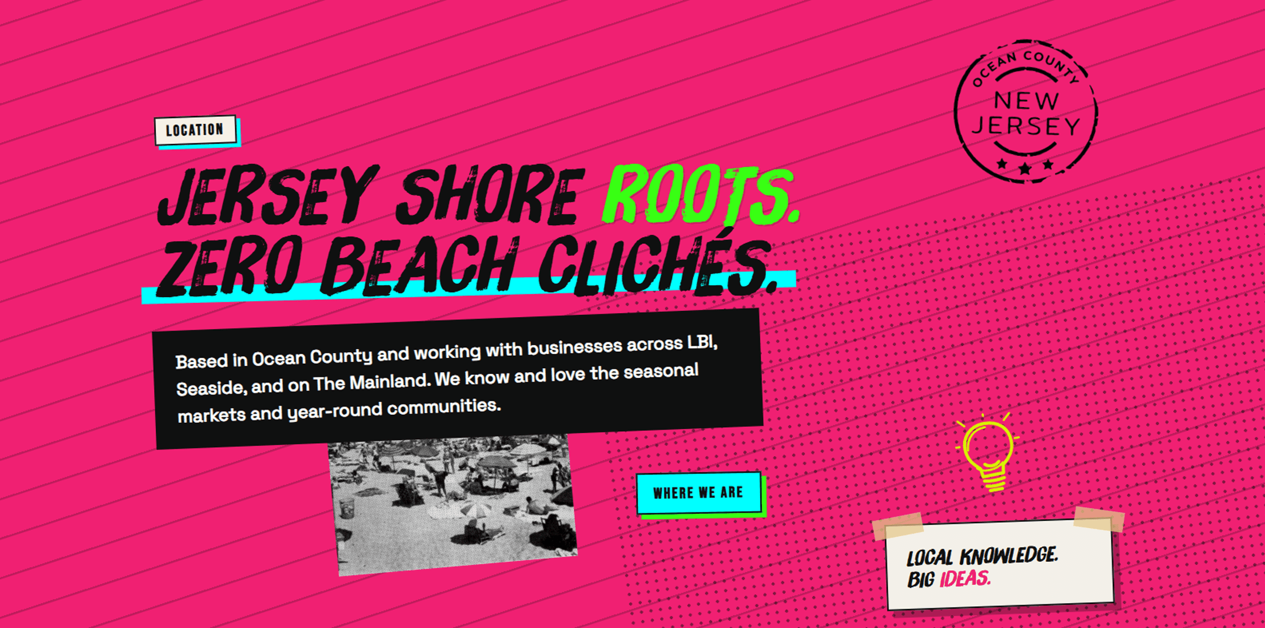
The location section plants the flag in Ocean County without turning the site into a postcard rack.
We know the Jersey Shore has more than one speed. There are summer crowds, off-season regulars, seasonal businesses, and year-round communities—and each one communicates differently. That local knowledge matters when the work has to reach visitors in July and still mean something to the people here in February.
So the site says where we are with a postmark, a map, and a little attitude: Jersey Shore roots. Zero beach clichés. No weathered anchor logo required.
A site with nothing to hide
The portfolio is intentionally straightforward. The work is divided into the same four categories as the services, so visitors can move from what they need to examples of what it looks like in the wild.
GG Creative is new, and the website does not pretend otherwise. The portfolio will grow as projects launch. Client feedback will replace the holding message as it comes in. Case studies will get written when there is a real story worth telling.
Real client stories are coming soon. We’re collecting feedback from projects out in the wild.
The website is not a finished monument. It is a working surface—built to change as the studio does.
Send the signal

The last section drops the pitch and opens the line. If you are building something, fixing something, launching something, or trying to make it impossible to ignore, tell us about it.
- Email: graphicgeekscreative@gmail.com
- Phone: 609-618-1173
- Location: Ocean County, NJ
We read every message ourselves. There is no bot warming you up and no gatekeeper deciding whether your idea sounds expensive enough.
The cord is cut. The site is live. Now let's make some noise.
GG Creative is a branding, graphic design, web, and marketing studio based in Ocean County, NJ, serving LBI, Seaside, and The Mainland.
